In this blog, I'm going to be talking about our top five pillar page designs - but before I get into them, I'd just like to explain what a pillar page is and why it's important. This means talking about topic clusters.
The state of search engine optimisation
Over the years, search behaviour has changed considerably. Originally, searches were done on desktop computers. Then, a few years later, smartphones. Nowadays, you don’t even need a computer or phone, you can just ask your digital home assistant (Alexa, Google, Siri or Cortana) anything you like.
What this means is that one search query can potentially come in three different formats: a full sentence on desktop, a shortened version on mobile or a question to a home assistant.
Subsequently, each format can differ in terms of delivery. For example, a question asked of a home assistant will be much more conversational and closer to natural language, while a search query on a desktop computer will be more keyword heavy.
As a result, search engines have updated their algorithms to better understand the method and intent of a search. Search engines no longer look at just keywords when delivering results and put greater emphasis on topics: content that can answer all the questions searchers have on that topic.
This in turn has led to a new SEO approach called topic clusters (a core part of your B2B content marketing strategy - find out how to create one here).
The topic cluster model is where a single “pillar” page provides the answers to all of the questions on a particular subject, acting as a hub of information. Linking off from this page are further content pages like blogs and videos, providing further information related to that same topic. Critically, these additional items of content then also link back to the pillar. This linking signals to search engines that there is a relationship between all of these pieces of content and positions your website as an authority on that topic.
If you’re interested in learning more about the topic cluster model, take a look at our eBook – ‘Topic Clusters: The Next Step in Your Content Marketing Strategy’.
Pillar page best practice
One of the most crucial elements to get right when creating a topic cluster is your pillar page, and there are a few best practices that you should follow when building one.
These are:
-
Make sure the word count is anywhere between 2,000-5,000 words initially (there’s no limit to how long your pillar page can be)
-
Apply the usual SEO optimisation best practices, i.e. ensure you include your target keyword in the page title, meta description, URL and throughout the copy
-
Include various types of media on the page to keep visitors engaged
-
Include your pillar page in the main nav bar and, if possible, publish it to a top-level domain
-
Vary your conversion points on the page – don’t just send people to landing pages, deploy live chat for example
-
Include a table of contents at the top of the page, possibly one that follows you as you scroll down, to make it easy for people to navigate the page (there will be a lot of content to navigate!)
-
Link to related external content and your own
- Give visitors the option to download all of the information on the page as an eBook as well
Now, there are two common ‘types’ of pillar page designs/styles: the resource pillar page and the 10X content pillar page.
The resource pillar page
These pillar pages balance owned content and outbound links. They’re more like listing pages with links to lots of different pieces of content and a small blurb introducing each one. As they function like a contents page (providing you with all of the content available on a certain topic) they make for great reference pages that you can bookmark.
HelpScout has a great example: https://www.helpscout.com/customer-acquisition/
The 10X content pillar page
A 10X content pillar page is mostly owned content. It goes into an incredible amount of detail on a topic and its format is more like an ungated eBook.
The Moz Beginner Guide to SEO is a great example: https://moz.com/beginners-guide-to-seo
Now onto our top five-pillar page designs...
1) The Wistia Guide to Video Marketing, Wistia
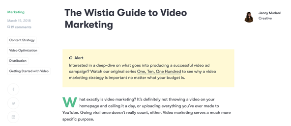
Wistia’s pillar page for Video Marketing is a great combination of both the 10X and resource style pillar pages. The links are laid out in a clear and consistent manner, making it easy to see the resources related to the topic. At the same time, each link comes with a summary of the piece of content it links to, allowing you to get a thorough understanding of the topic by just reading through the page.
However, usability could be improved if the contents section wasn’t all the way at the top of the page and followed you down on the sidebar. Similarly, the page doesn’t include any other types of media like video, which would help to keep the reader engaged.
2) Instagram Marketing: The Ultimate Guide, HubSpot
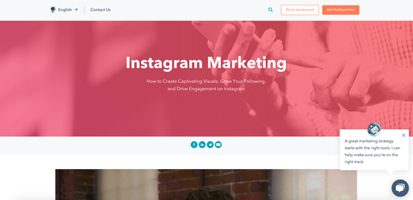
HubSpot’s Instagram Marketing pillar page starts with a great video that gives you all the information you need to get started with an Instagram marketing strategy. You have the option to watch the video, browse through the page or do both, depending on your preference.

HubSpot also has a good conversion strategy for this page: they use a combination of calls-to-action (CTAs) linking to relevant, downloadable content throughout, and also have a chatbot on the page.


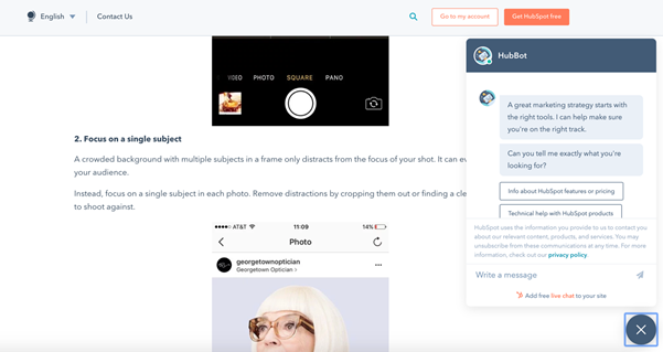
Similar to Wistia, though, the page could benefit from either a sticky navigation bar or contents section that follows you down the page to improve its usability.
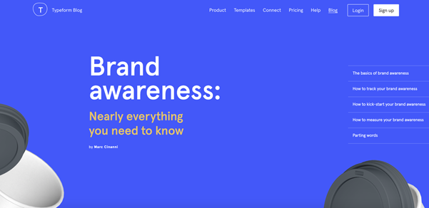
Typeform’s pillar page has an instant impact visually and uses animation throughout the page to make it interactive.
It’s a 10X content style pillar page and reads more like a very detailed, ungated eBook. If done incorrectly, this could have resulted in the page being overwhelming and difficult to read, but Typeform has done a great job of structuring the content in a way that’s easy to digest. It’s bold, full of quotes, and signposted with strong headers, bullets and pull-out sections of text.
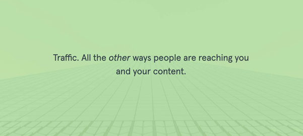
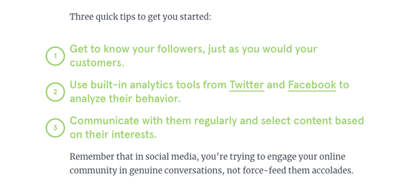
Also, if a visitor hovers over one of the quotes, they can retweet it – which is a nice touch, indeed!

The page could benefit from a sticky navigation bar, much like the examples above, and doesn’t offer many clear conversion opportunities, other than a banner that stays at the bottom of the page as you scroll down.

4) A Modern Workplace with Microsoft, IT Lab
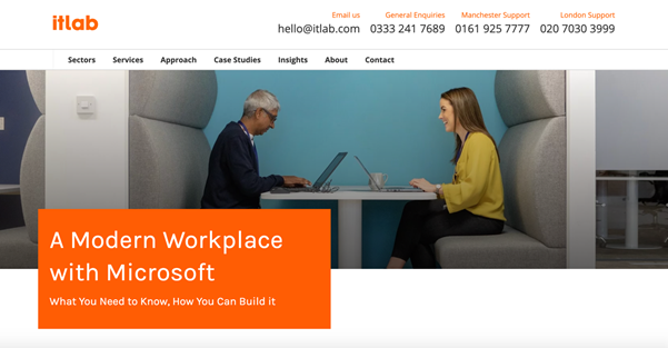
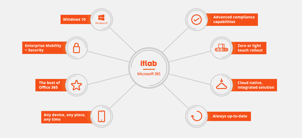
IT Lab’s pillar page on the Modern Workplace is a great example of how to use styling to make content engaging and easy to digest. It uses a great combination of imagery, video, diagrams, tables and banner sections.
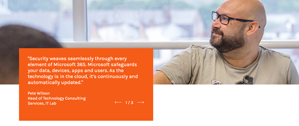
The other thing I really like about this pillar page is the Star Trek references that are used sparingly throughout the copy. It turns fairly techy copy into something amusing and enjoyable to read.
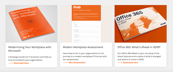
The pillar page is also well optimised for conversions and includes some complementary resources that are available for download directly from the pillar page.
5) Conversational Marketing, Drift
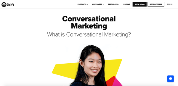
Drift combines imagery, colour accents and diagrams to make a brilliant page that is clear and concise. The page covers the fundamental questions on conversational marketing, including what it is, how you do it, the benefits and FAQs.
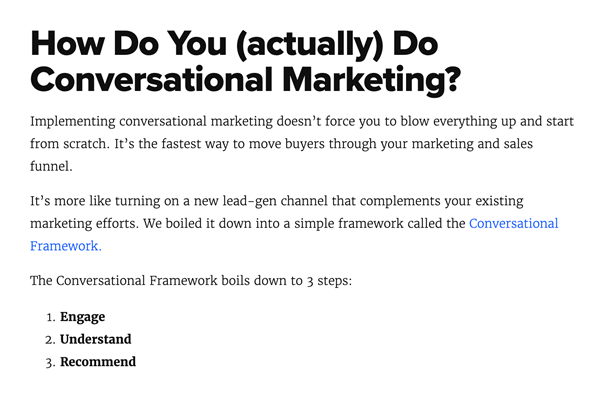
The page is optimised really well for conversions by using bold, relevant CTAs which provide further resources to help the reader.

However, it’s a little short on copy for a pillar page – which could explain why it’s not made its way into Google’s Featured Snippet for the search term ‘conversational marketing’.
To conclude...
All in all, it’s imperative that businesses adopt this SEO strategy if they are to compete online. The results we have seen across our client base show the impact it can have – and in a short time frame. Using topic clusters, businesses can very quickly rank for highly competitive, broad terms, even when they’re up against the likes of Microsoft and HubSpot.
Just remember to:
-
Cover the topic in great detail and answer every possible question
-
Break up the page in a way that makes it easy to read and not just a wall of text
-
Optimise the page for conversions (you don’t want to miss out on those leads!)
-
Make the page easy to navigate






-3.png?width=500&height=320&name=Matt%20-%20imagery%20bank%20(8)-3.png)
