.png?width=80&height=80&name=circle-cropped%20(2).png)

This blog was first published in February 2015 and has been updated in October 2018.
Are you struggling with designer’s block and lacking inspiration for the design for your next eBook? Don’t fear! It happens to even the best of us.
You want to make sure your eBook design is worthy of the fantastic content it will contain – go you – but designing an eBook is no easy task. There are a number of different elements that need to be addressed; everything from font and text size to custom graphics, images and colours.
To help you design eye-catching eBooks, however, we’ve written this blog and outlined the process and the steps we take to ensure eBooks are created with design, content and our readers in mind.
But before we jump into the things you should definitely do to ensure that your eBooks are beautifully designed, the design of eBooks, reports, guides – or any other piece of content that you consume, is just as important as its content. They sit side by side, so don’t focus on one over the other. If you have a poorly written content piece that’s beautifully designed, your readers won’t learn anything – and by that same token, if you have a really well-written article that is terribly designed, you’ll soon turn your readers away!
So, without further ado, here are our 10 top tips for designing an eBook:
1. Stick to those brand guidelines!
But don’t make them all look the same! This may sound like an oxymoron, but as you will come to understand when designing eBooks, the devil is most certainly in the detail! Keep the style uniform, but push the boundaries of what you can change to make sure the end result looks different. Sticking to your brand guidelines is essential; it will make your content look professional, credible and, above all, recognisable as readers move from case studies and research reports to thought leadership articles and white papers.
Before you start designing, establish the ground rules for the brand style of your marketing collateral – this should include elements like your corporate fonts, header size, main body text size, colours, company or partner logos, icons and photography/imagery – and then create your eBooks using these building blocks. Differentiate your eBooks with colours or cover images – perhaps using certain title placement or designating a corporate colour per eBook is something worth considering. Above all have fun with it and make sure you stick to the brand guidelines!
Want a great example? HubSpot has posted its brand guidelines on its website – and it’s a fantastic example of just how detailed brand guidelines should be.

2. Keep the front cover simple, yet eye-catching
Your eBook’s front cover should catch the attention of your readers and encourage them to download the eBook or to turn to the next page. The best way to do this? A bold and striking image.
If you’ve ever wandered around a bookshop or music store (yes we think they still exist), chances are you’ll notice the book or CD/record with the bold and visually appealing front cover versus the one with the blank background. The fact is we’re often drawn to images on a page as they catch our attention.
That said, we have to add an obvious caveat here in that there are exceptions to this rule. For example, an eBook with a white background and big bold lettering for its title may be equally as eye-catching. Of course, choosing an appropriate font does depend on the style of your website to some extent, as well as your trusty brand guidelines and your overall corporate image.
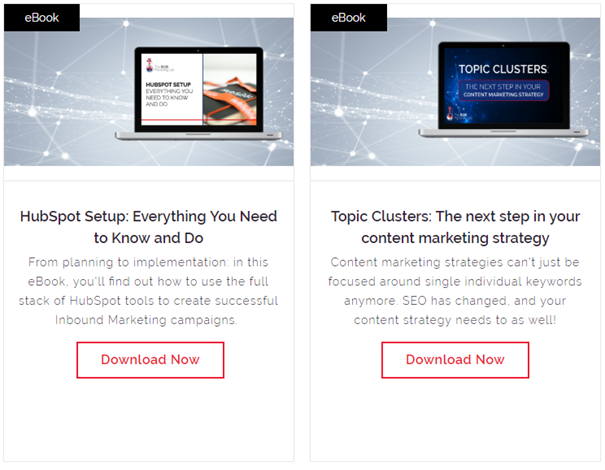
3. Think about your eBook thumbnail
You also need to think about the eBook thumbnail. The thumbnail is essentially a reduced-size version of your eBook image and plays a crucial part in getting website visitors to click through to the actual eBook. It should let website visitors know what they are about to click on and why it’s something they should be interested in.
Take a look at the thumbnails below and how you can read what’s on the front of the eBooks before you’ve even downloaded them!
4. Use different font sizes to guide your readers
Not only is this relevant to your website, it’s also relevant to your landing pages and eBooks too.
Headers, sub-headers and paragraph text can help you to guide your readers. If there are pull-outs and stats you want to highlight, you can use larger, bolder fonts to make them stand out and emphasise their importance to the reader.
But why is this important?
Because it’s really annoying to download an eBook that you think will be well-designed, engaging and thought-provoking, only to get a document with loads of text in size 11 font on a white background. Without headers, sub-headers or even pull-out quotes or stats, there are no indicators on the page to designate sections or important information and it makes digesting the information on it incredibly difficult.
Here’s a good example of what an eBook page should look like!

5. Don’t forget the images…
As mentioned previously, as well as being able to lead the reader through the page using headers, sub-headers, pull-out quotes, bold fonts and other elements, you can also use imagery to break up your text and help distribute it on your pages more evenly.
Also, your readers will more than likely remember and recognise your eBook based on what it looks like, as opposed to strictly the words written on the page. Use fantastic imagery; and don’t skimp on it – if you use really poor imagery, it’s very easy to make your eBook look poorly designed very quickly.
6. Use Custom Graphics
Icons and graphics are a fantastic way of emphasising a point. If you’ve got facts, quotes, stats and figures, using small icons and graphics alongside these is a great way of making them stand out and catch the eye of the reader.
Infographics, for example, are a really effective content format. They encapsulate information using graphics, allowing content to be presented quickly and clearly. By using images and associating those images with specific bits of information, infographics leave a lasting imprint on the mind of readers.
According to the Content Marketing in the UK 2018 report by the Content Marketing Institute (CMI), infographics are one of the top content marketing formats used by B2B marketers in 2018 – with 65% of respondents saying so.
Statistics from Business2Community, a top business community website, show that infographics are liked and shared on social media three times more than any other type of content and that publishers that feature infographics on their website grow 12% faster than those that don’t.
7. White space is your best friend
We love colours, and we love big images, but sometimes a healthy amount of white space is just as important. As much as you want to include lots of information, text, headers, images, pull-outs, quotes and stats, you also want to keep things neat and tidy – and that’s where white space comes in.
Just take a look at Apple’s website, for example. Apple takes advantage of high-quality images, bold fonts and colours but also keeps its design minimal, which in turn draws more focus onto what’s on the page without distracting the website visitor.
Another good example is the NVIDIA website. It has a banner image on the main page with a prominent call-to-action and cycles through four images. The banner image is split from the subsequent thumbnail images below and features a lot of white space, allowing visitors to focus on each item being offered.
A healthy dose of white space will keep your eBooks (and any other content assets) looking clean, sophisticated and easy to read.
8. Don’t go too overboard with lots of colours
Just as white space is important, so too is colour – but don’t go overboard!
Only ever use colours from your brand guidelines when creating corporate content. You’ll probably have two or three main colours that you should stick to, as this will keep things consistent and seamless as website visitors move from web pages to eBooks.
Colour can be used to focus in on specific parts of the page, and highlight important parts you want to shout about. A vibrant colour like red could be used for emphasis, whereas blue is a little more conservative and could be used for the background. Every colour can be used to aid the design of content assets and to present information on the page in a certain way.
9. Make it shareable
If you spend time creating a fantastic piece of content and turning it into a beautifully designed eBook – the next step is to make sure it’s easy for people to share.
If you didn’t know already, within PDFs you can include online links, either to other webpages, or also social sharing buttons so readers can share the eBook landing page to Twitter, LinkedIn or other sites with just one click. Just remember to share the landing page and not the PDF itself, otherwise, you won’t know who’s reading it!
10. Make it unique
Lastly, there’s a good chance that your competitors and companies similar to yours are building eBooks, reports and guides just as you are, so you need to make sure that your content is unique and of high quality.
If you follow your brand guidelines to the letter, everything you create will be consistent and, over time, your target audience will come to understand who you are and what your business is about. If your design is inconsistent, messy or unprofessional – this will leave a bad impression and decrease the number of downloads you receive for your content assets.
High-quality content is of utmost importance, yes, but without solid and consistent design your target audience will quickly lose interest. High-quality content needs to be supported by aesthetically appealing and consistent design: cool colours, striking images, structure, white space and custom graphics.
But don’t go overboard. The idea is to make your eBooks look professional – minimal. Good design doesn’t detract attention away from the content but rather accentuates it.
Our ten tips for designing your eBooks should lay a solid foundation for the future, so make sure you follow them and stick to your brand guidelines.

.png?width=500&height=320&name=Image_1__Dynamics_365_to_HubSpot_Migration__What_Enterprise_Teams_Need_to_Know%20(3).png)


.png?width=500&height=320&name=Image_1__Why_CRM_Implementations_Fail_(And_What_Enterprise_Teams_Can_Do_About_It).png)
.png?width=500&height=320&name=Blog%20Cover_%20AEO%20for%20HubSpot_%20What%20Enterprise%20Teams%20Should%20Be%20Doing%20Now%20(1).png)
.png?width=500&height=320&name=How%20to%20Fix%20a%20Broken%20GTM%20Strategy%20_(Before%20You%20Throw%20More%20Budget%20at%20It).png)
