
Interprefy
Huble partnered with Interprefy to How Interprefy boost sales efficiency by 27% with AI
Marketing Strategy & Tech
HubSpot Implementations
Sales & Revenue
There are no results
Critical user journey mapping, UX optimization, and web design
OAG, a global travel data provider, engaged Huble for help rebuilding and optimizing their home page from the ground up.
As one of the oldest data aviation companies, OAG has a heritage of providing highly robust and information-rich datasets for multiple industries. But their home page failed to reflect their status as leading travel data experts. Another problem: their home page didn’t do enough to highlight their core offering, leading to a rocky buyer’s journey and missed opportunities to convert customers.
To solve these issues and generate more business through their website, OAG needed a strategy-obsessed HubSpot partner with expertise in web design, user experience (UX), and crafting effective customer journeys. They found their ideal partner in Huble.
With our research in hand, we mapped the ideal critical user journey for the home page. To ensure a seamless user experience and easy navigability, we recreated the website menu to better help visitors find the information they needed.
Under our new user journey, visitors are given a greater opportunity to learn about OAG’s offering and what datasets could be used to solve their problems. Unlike the original page, which pushed visitors to book a call with a sales rep, the primary call-to-action for the new homepage is to get users to access a dataset that would fit their needs. Reflecting this, we added a module to spotlight their most popular datasets. Qualified leads and visitors who identified their desired datasets were then invited to speak to a representative or request a data sample.
We worked with OAG to improve their copy with stronger, clearer ‘action words’ to guide users through their buyer’s journey. We also reworked and added or removed several modules. For example, we positioned OAG as industry leaders by adding testimonials and the logos of OAG’s most prominent clients to the social proof section of the home page.

Old home page vs. New home page:


“This has been our first engagement with Huble and we are delighted with the results so far. Their expertise have allowed us to identify our key customer journey and produce a beautiful, optimized website — all of which has resulted in a better customer experience. We can't wait to get started on the next phase of the project!”

Huble partnered with Interprefy to How Interprefy boost sales efficiency by 27% with AI
Marketing Strategy & Tech
HubSpot Implementations
Sales & Revenue
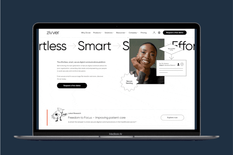
Discover how Huble empowered Zivver to transform their SEO strategy and optimise their website for conversions
SEO & Paid Media
Website Design & Development
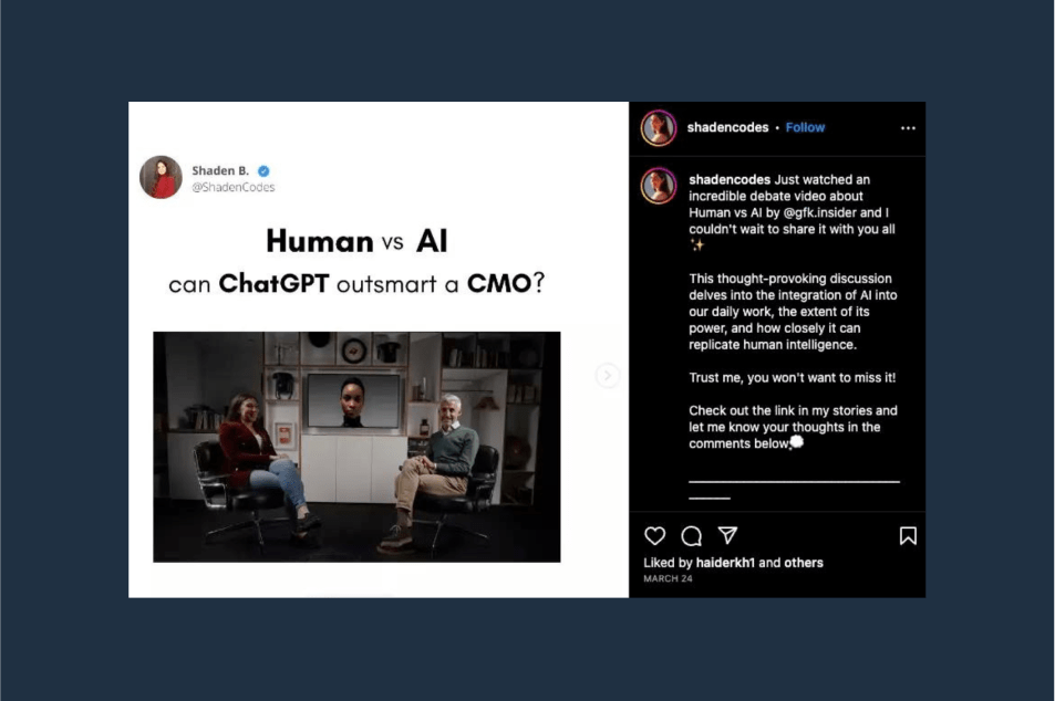
Learn how GfK established itself as an AI thought leader through an innovative & fun AI-powered campaign featuring a debate between ChatGPT & GfK’s CMO.
Marketing Strategy & Tech
Creative

Learn how Huble reworked and optimised Google Ad campaigns and paid media strategy to generate more high quality leads — at lower cost for a retail software provider.
SEO & Paid Media

Learn how Huble helped GCPay drive growth through innovative digital marketing strategies including ABM, SEO-driven content creation & conversion optimisation.
Marketing Strategy & Tech
SEO & Paid Media

Find out how the Huble team helped Isos Technology refresh their visual branding and design a new website that highlights their services and increases conversions.
Website Design & Development

Find out how the Huble team helped OAG rebuild and optimise their homepage and drive revenue through their website.
Marketing Strategy & Tech

Discover how Huble Digital worked with GGMS Coaching, a US-based marketing and database conversion company, to rebuild its sales, payment, and client onboarding processes from scratch.
Sales & Revenue

Apaleo needed an experienced consultancy to help refresh their Corporate Identity (CI), relaunch their website and integrate the HubSpot marketing tool.
Website Design & Development
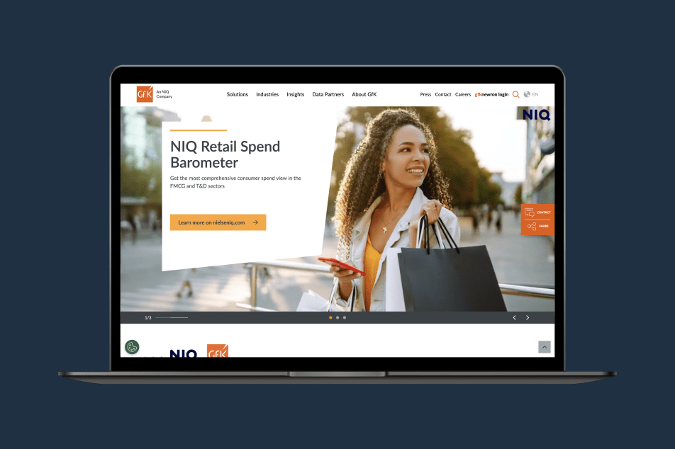
Find out how Huble helped GfK redefine their global marketing efforts using the HubSpot platform.
Marketing Strategy & Tech

Find out how Huble Digital kickstarted Interprefy’s marketing success by moving them to HubSpot CRM & building an SEO, lead-generating website from scratch.tio
SEO & Paid Media
Marketing Strategy & Tech

Learn how we supported The NAV | 365 People's marketing team while their manager was away — and improve their marketing results
SEO & Paid Media

Find out how we consolidated Compleat's four websites into one lead generating website for long-term growth
SEO & Paid Media
Marketing Strategy & Tech
Creative
Website Design & Development

Learn how Huble Digital supported Bond International Software's paid advertising campaigns, improving cost per conversion and delivering a strong ROI.
SEO & Paid Media

Learn how Huble Digital provided Broadbean Recruitment Software with two days of bespoke HubSpot Consultancy and Salesforce integration support.
Marketing Strategy & Tech

Find out how Huble Digital helped Accountancy Software provider CaseWare to launch a B2B content creation programme to drive new leads through its website.
Marketing Strategy & Tech

The Huble Digital PR team helped to successfully launch Sailthru into the UK
Marketing Strategy & Tech

Understand how we helped Travelport deploy large-scale paid media campaigns across various social channels
SEO & Paid Media